The interior design world is due for something happy, earthbound, familiar, and welcoming. Enter warm neutral tiles.

A welcoming warmth is spreading over the design world, and it can’t get here soon enough! We’re excited to welcome the entire family of warm neutral tiles and highlight the refreshing ways in which they’re being used. And we’re not alone. All but banished until recently, they are the new darlings of design.
For more than a decade, cool grey interiors were the de facto definition of residential sophistication. Meanwhile, over on Instagram, the memes du jour were white, overexposed room images (both in lighting and in repetition). These spare, white envelopes held sparse white furniture and usually culminated in enormous, blindingly blown-out windows or open doors. Perhaps because we needed to escape? Well, here’s where we’re going:
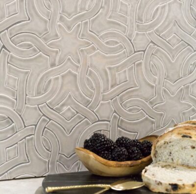
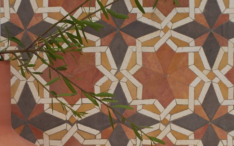
Light Wood and Linen Tones
Colors in the “greige” family are borrowed from pale linen and wood. Says ELLE Decor, “Light, wood-inspired shades are a great alternative to traditional beiges or tans. Neutrals that take on ash, maple, or pine tones are perfect for the minimalists and color-phobics alike.” While not as overtly toasty as the others, this still moves away from a strictly cool grey look and into the warm neutral tile trend. For example, take a look at our Moresque Ceramic, pictured here.
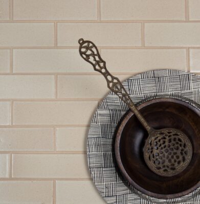
Honeyed Creams
The new creams transition into more honey or maple-infused warmth and move away from the decidedly chillier off-whites of recent years. Our popular Temple Brick is a glazed ceramic tile aptly named Creme Brule. It’s probably no coincidence that the names of these hues are all on the sweet side. These are the tastiest creams we’ve seen in some time.
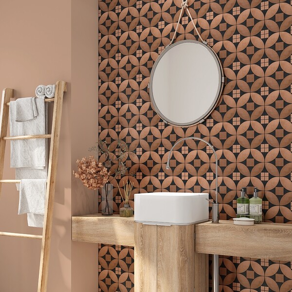
Clay, Bronze, and Classic Terracotta Colors
Austin is in style, and so are desert hues. Sherwin Williams’ 2019 Color of the Year is Cavern Clay, a southwest-inspired soft terra cotta. ELLE Decor declares these colors, “elemental, nature-inspired” and, yet, “contemporary.” At Country Floors, we’ve never strayed from the always-welcoming look of terracotta. Says interior designer Michael Tavano, “If you’ve invested in a cool, grey interior a touch of these coppery and terra cotta tones are just the thing to warm it up. From a sofa throw to a floor-to-ceiling tiled entry hall, these tones marry beautifully with cool greys and white.”

Sunflower, Dijon, and Turmeric
The human eye sees yellow tiles first. That’s why school buses and caution signs are yellow. Besides being first to the party, Tavano says, “They’re the color of happiness, of optimism. You look at them and see spice and heat. Yellow stands for the very source of light itself, our sun. It’s one of my favorites right now,” says the designer, “and used properly its relevance will last forever.” The relevant yellows of which Tavano speaks are neither buttery nor bright, but rather the slightly murky-in-a-good-way, spice-market tones. Their understated vibrance makes them timeless and they mix beautifully with warm or cool colors. We feature them in ceramics and terra cottas.
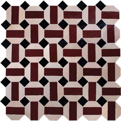
Saturated, Radiant Berry Hues
The last color you might expect to be featured in a story featuring ceramic tile is red. All glaze is glass and red glass is notoriously difficult to achieve. As a result, bold, saturated reds are a rare achievement. But that’s never stopped us. Vibrant, super-saturated reds are here to stay, and they have a sophisticated classicism that feels poignant, moody, and perhaps even sultry. This is also a tone that will elegantly update a formerly grey or white (or grey and white) interior.
Final Thoughts
Step into a cozier atmosphere with the warm neutral tile trend. A refreshing turn away from chilly cool tones, this trend is ideal for anyone who wants to add some warmth to their interior.
Country Floors showrooms, and select luxury tile and stone showrooms nationwide offer the ceramic tile, stone, and mosaics pictured in this article. You are our inspiration and our guide. If you’ve recently completed an installation of the Country Floors tile, please let us know by tagging @country_floors on Instagram. We might feature you in an upcoming designer interview.