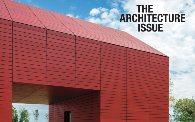
We love regional shelter titles. We revel in the discovery of a unique point of view that comes from a particular pride of place.So we love the Cottages & Gardens library of titles that cover stellar places we adore like the Hamptons, New York (city and state) and San Francisco. And then, there’s Connecticut. If any locale in this country truly understands, nurtures and celebrates Americana and classic design, it’s surely Connecticut. So, we were pretty pumped to see the March architecture issue, with a thrilling red, white and blue cover featuring a house with all the spirit of a classic barn contained in a truly sleek, minimalist almost Nordic structure. Wow. Americana drama.
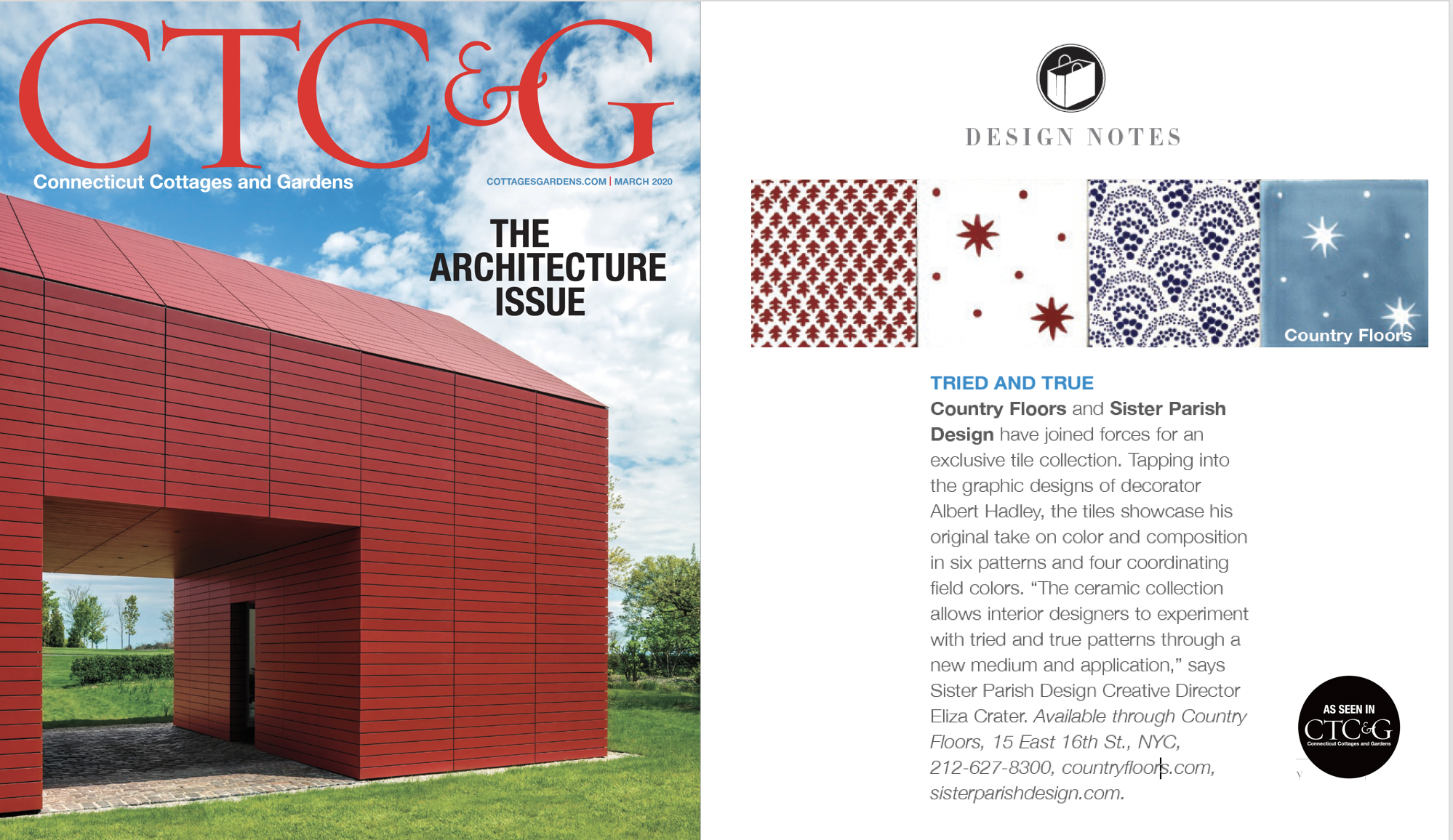
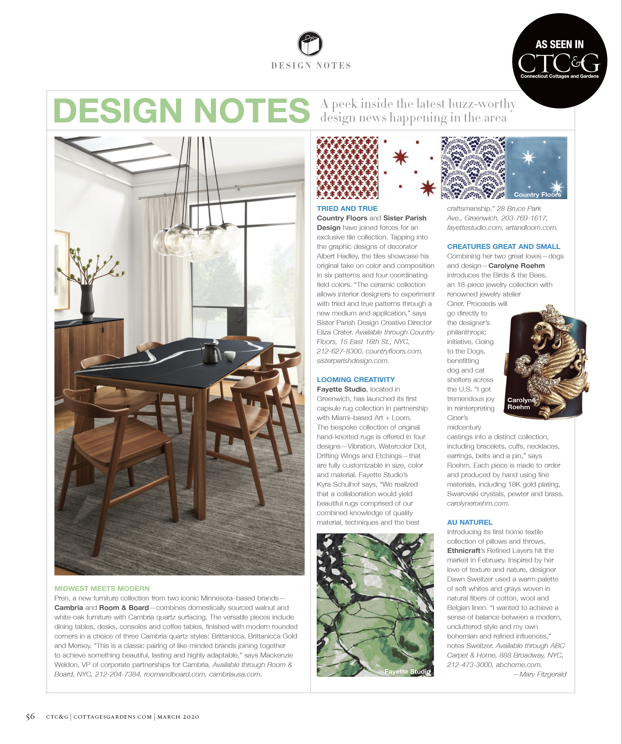
As always, the editorial well of the issue is filled with houses you want to explore and that may, fair warning, give you a massive case of the #goals. And up front, in the always-fun Design Notes section, there they are. In red, white, and blue, the tried and true patterns of American design icon Albert Hadley, known and beloved already on fabric and wallpaper, and now emblazoned on our ceramic tile. Albert Hadley was a great patron of Country Floors, specifying our tile for notable Parish Hadley projects so lofty we dare not even say….and we’re tickled that our heritage American brand and these heritage prints born from the work of one of the top most influential American design firms of the 20th century, are together now in a Country Floors ceramic tile collection by Sister Parish Design Three cheers for the red, white and blue.