
We covered six colors in our last post. Let’s recap where we were and then cover three more! There are very distinct human responses to color. I have always been drawn to saturated, emotional colors. But that is me. As we discussed previously, the respected Ms. Angela Wright, on her website Colour Affects, tells us that there are eleven emotional colors and we then described them below:
WHITE is hygienic.BLUE is intellectual.BROWN is serious GREEN is balance. PINK implies physical tranquility. RED is physical. BLACK is sophisticated and glamorous. YELLOW is emotional. VIOLET is spiritual. ORANGE is about physical comfort. GREY is psychologically neutral.
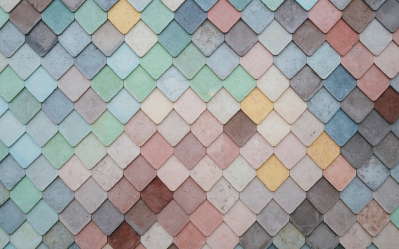
We want to discuss white again, since it can be so easily used as the backdrop for the insertion of all these other color values! Many of our Country Floors clients begin to work through their kitchen tile ideas and their bathroom tile ideas with white in mind. Often, the feature color is a separate tile or stone from the background color. As you can see in the image below, blacks and whites are unique pieces of marble!

Another approach is for the color to be on each tile so that the color combination is shown in real harmony. As you can see here, from the Country Floors Royal Makkum Collection, the crackled white glaze serves to deliver the classic Delft blue in a tile by tile style.

On to black and all that it implies. As per Ms. Wright, this color is sophisticated and glamorous, and who can argue? After all, when you get an invitation that says “black tie” what do you think about that event? On the other hand, many clients might be interested in black, but are a little bit wary of the black white combination. It might be little bit too stark for them. There are other ways to use black however. It can be paired with a soft cream color and with a rustic production technique the overall design effect is much more traditional. A panel from our Olde English Collection illustrates this perfectly.

If yellow is emotional, it may be in no small part attributable to the heat of our sun and its effect on our lives. Look no further in literature than “The Long Hot Summer”, by Mr. Tennessee Williams. Generally, clients that want to invite yellow into their design plans hope to do so with less drama than Mr. Williams was known for. Therefore, we offer the collage below, with the flower and vegetable from our Novelda Collection and the field tile in the middle from our California Collection.

The spiritual aspect of violet can be seen in Catholicism in the form of liturgical dress and in Hinduism as the color associated with the Seventh Chakra. We can also focus on the color in nature and let that be our design criteria. Again, the Novelda Collection gives is two floral tiles flanking a field tile from the California Collection in the panel below.

Next week, we will conclude these thoughts with orange and gray. As previously promised, we will hear from the Creative Director of Country Floors, Ms. Sylvie Atanasio. Until then, there are Country Floors locations all over America. Stop in and let them help you design with color and mood!