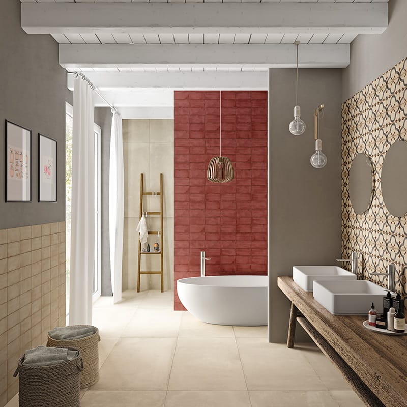
Opening our feed from Architectural Digest today, there was a cool take on the Benjamin Moore Color of the Year 2019. Immediately we saw this color to be a marked return to serenity as opposed to the color of the year selections from last year. So let’s chat about ”Metropolition”, from Benjamin Moore, as shown above from BM.
Ellen O’Neill, of the renowned paint manufacturer, was interviewed by Architectural Digest and said that the mood of global society had a great deal to do with this soft, neutral, color selection when she said: “I don’t know about any of you, but I need quietude. I need a pause. I need earplugs. I don’t even know what was going on at the time, but it was just like, stop the aggression, the crescendo of voices, the cacophony of tweets, and breaking news. It’s so invasive. I said, I know this is totally uncharacteristic of me personally, but I have a feeling that we should look in this [neutral] spectrum of colors.”

Appraising the functionality of “Metropolitan”, you are quick to notice that it is highly suitable as a classic background color value. In that same appraisal, you may observe hints of green that can be drawn out with other paired colors. In terms of coordinating colors, Architectural Digest offered us this: “Deep greens can dramatize the soft-spoken paint; while pale pinks and sages can layer in, to diaphanous effect.”
Where are Country Floors in all this? Since 1964 we have been a part of a select group of tile and stone vendors that have pursued the higher calling of “style-setting.” Inherent in that approach, is the ability to suggest ceramic tile, glass, and stone colors that play nicely with color values such as “Metropolitan.” Try it out and you will see!
For more on the Benjamin Moore Color of the Year, check out Architectural Digest.
